
BRUSH & CO | PAINT YOUR OWN POTTERY
PRODUCTION & PRINT DESIGN
THE NEED:
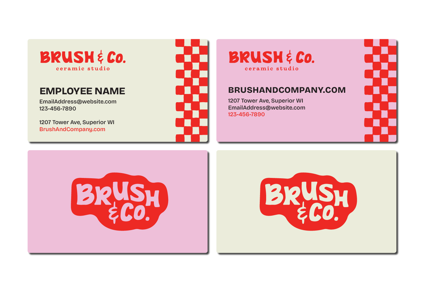
When the formerly-named Pottery Burn came under new ownership and a new name, it also needed a new look. After rebranding to Brush & Co, with a new logo and brand guide from The Cultural North, they came to me for help expanding the brand guide into real assets.
THE SOLUTION:
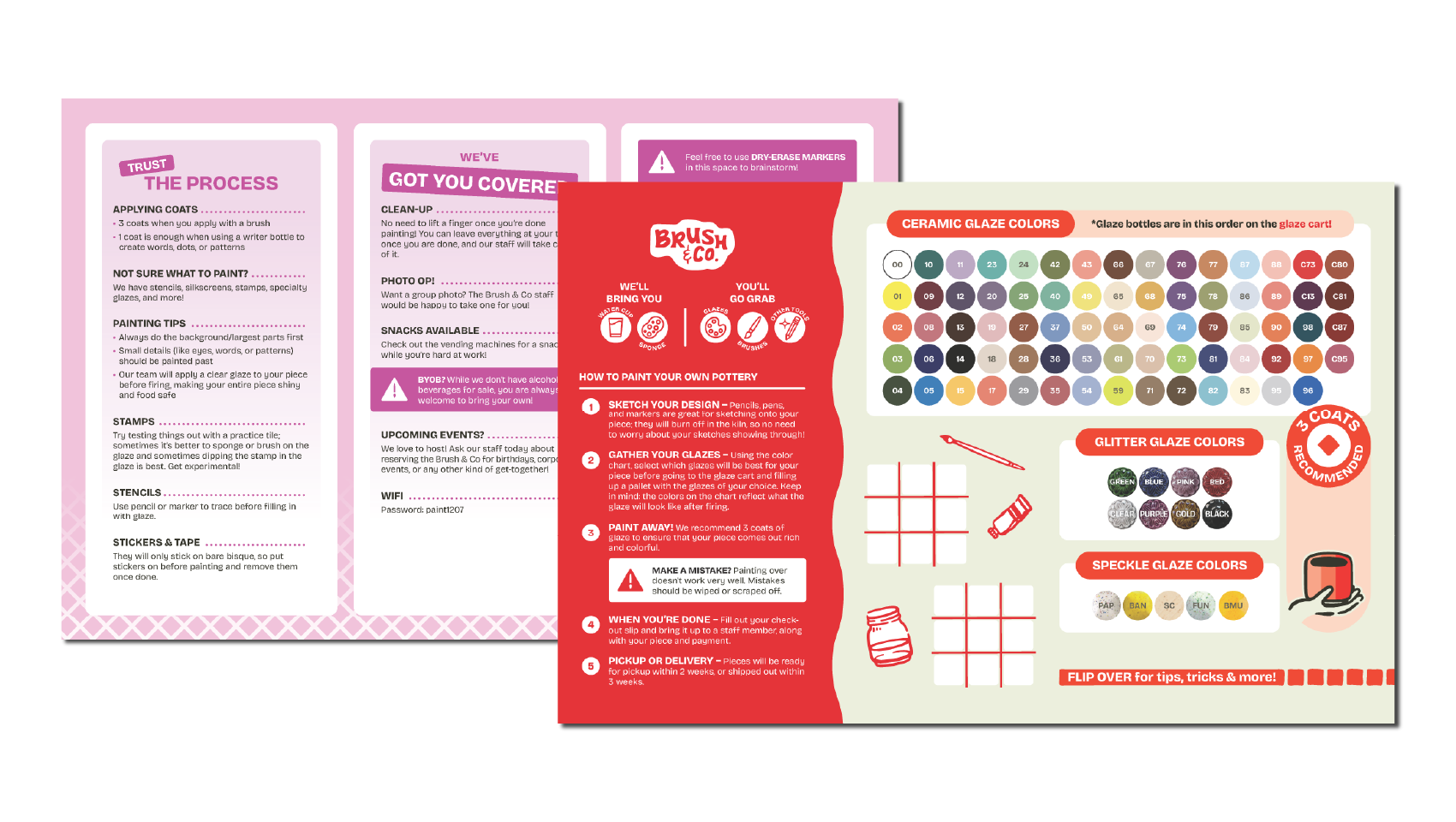
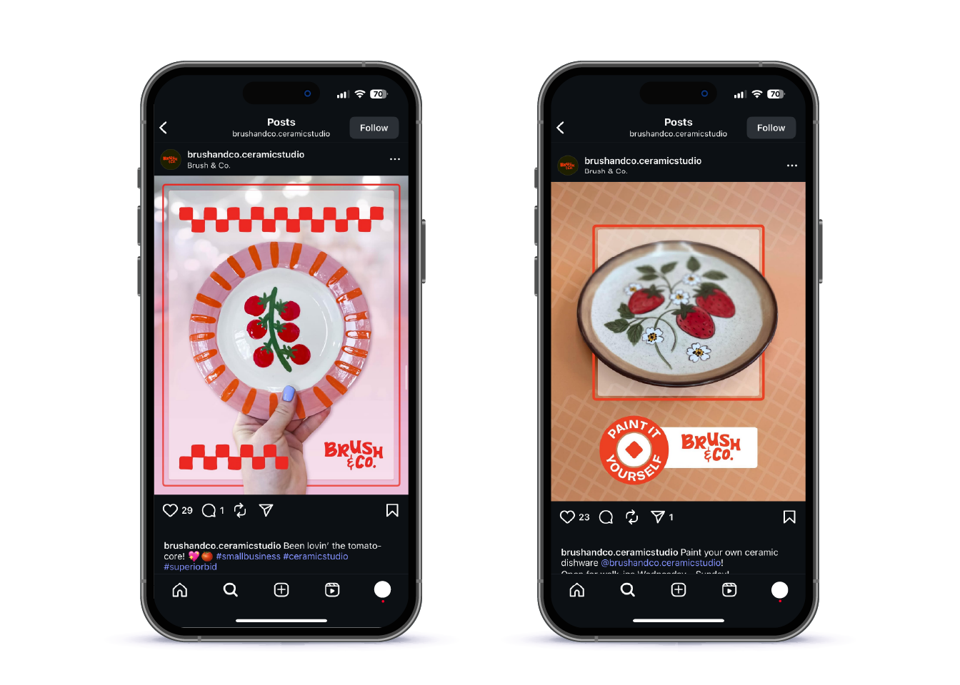
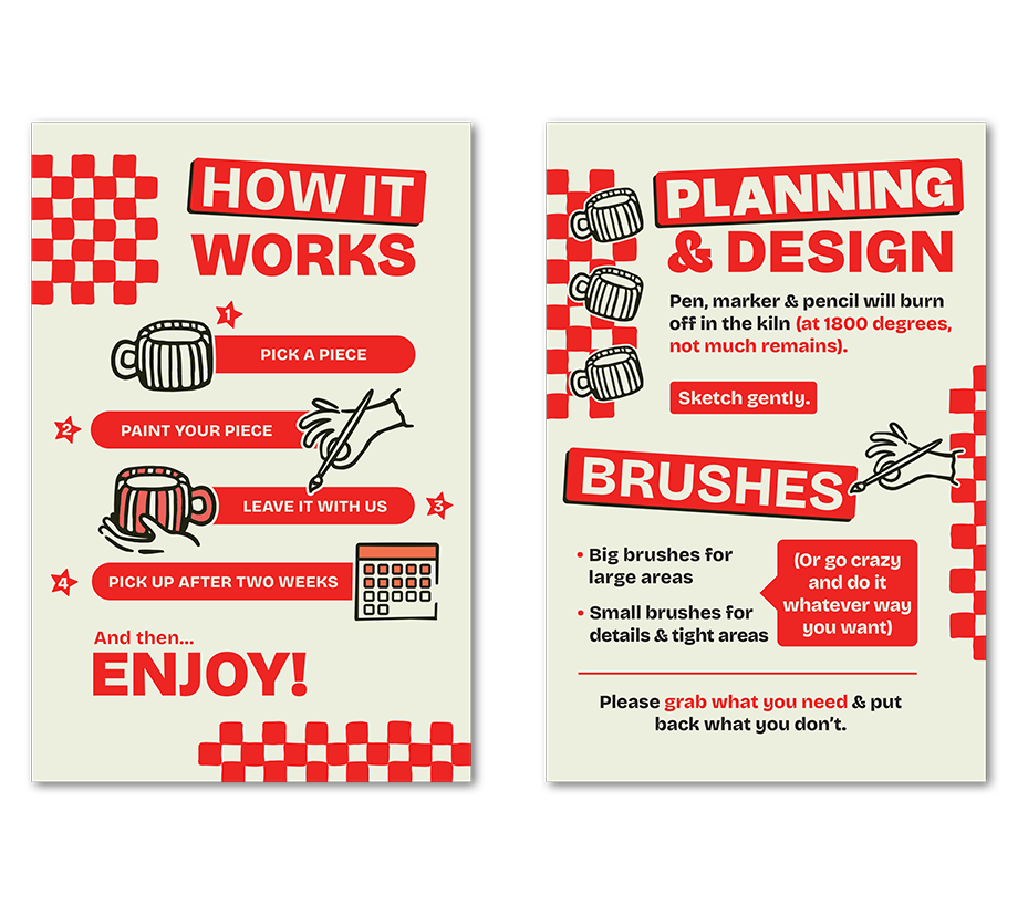
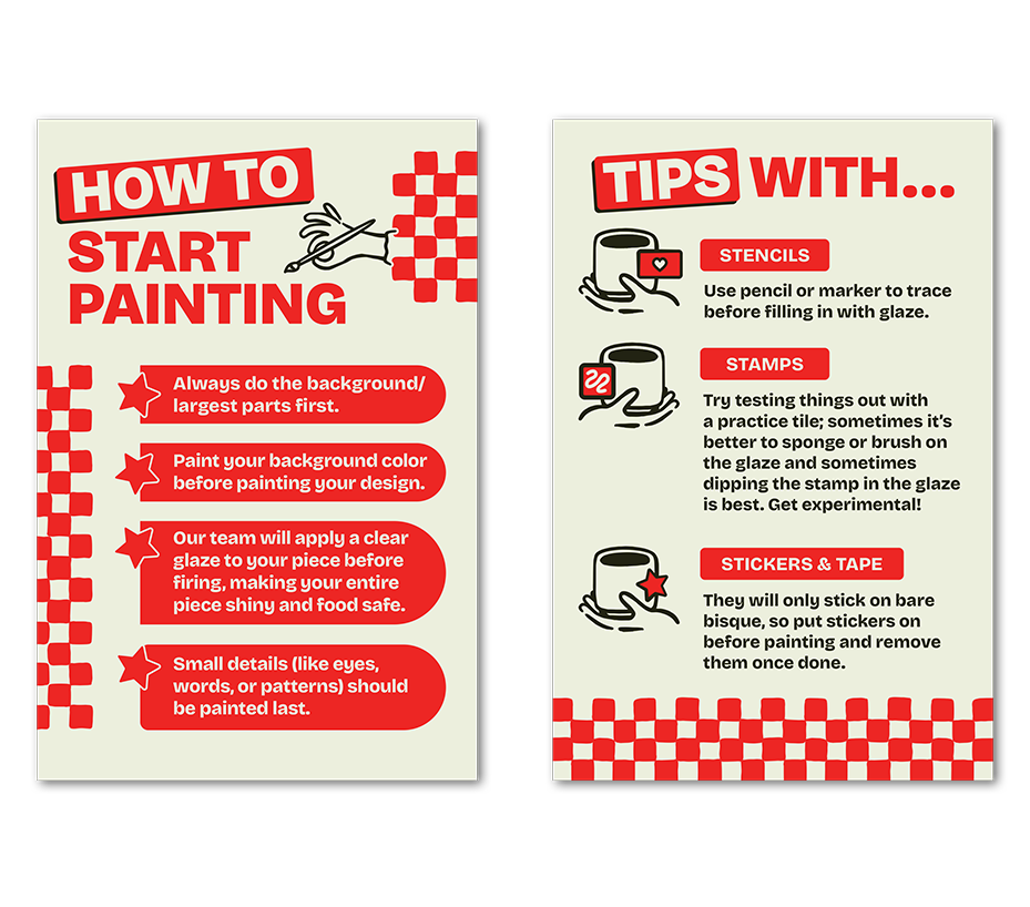
Trying to cater more to adults, it was important that assets for the Brush & Co felt artsy, colorful and kitschy, but in an elevated way. I worked to make the design aspects (both ones that I built, and ones that came from the brand guide) a focal-point of each asset, bringing in the diner-meets-paint-studio vibe throughout.
THE IMPACT:
The Brush & Co now has cohesive signage, handouts and more throughout the store, making it feel as though the branding truly lives in the space.
RETURN TO FREELANCE // PERSONAL WORK >